Component Properties
Contents
Old Versions
This page is current for Flowcode v11 and later. Earlier versions can be found below:
| Flowcode v10 |
| Flowcode v9 |
| Flowcode v8 |
Introduction
Component properties controls how the component functions as well as how it is displayed and where it is situated on 2D Panels or the 3D System Panel.
To bring up a components attributes and properties you can right click on a selected component and click 'Properties' from the context menu.
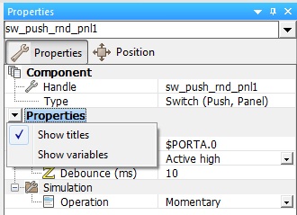
This will bring up the 'Properties Panel' (as displayed to the right), there you can see the components attributes and properties.
If the Properties Panel is already being displayed simply click on a component to bring up it's properties on the panel.
The properties for the component can be edited in the Properties Panel by simply clicking the property value and/or typing in a value, this depends on the component and the property, many components have similar properties and some serve a completely different purpose because of the radical difference between some components.
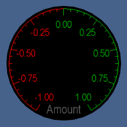
There are many different properties used in a range of different components, take the Scale Arc component for example, this offers a vast range of properties to customize the appearance and function of the component.
The Scale Arc component properties allow you to change the colour of the negative and positive markings, labels and backgrounds as well as the resolution and shape of the canvas. There are many other properties available to change to customize the component to suit your desired purpose, you can change nearly every aspect of the Scale Arc just by changing the properties of the component.
The broad range of properties makes the component an excellent component base got creating or further improving existing components by adding the component or tying in its functionality with different components. By having so many different component properties readily available from the get go, it allows you to create create a robust and complex component which can be suitable for many different purposes and use in different fields entirely due to the wide range of functionality available.
A lot of components rely on other components, and some components are only used to support other components, such components as the Button helper and switch base, are used to create and enhance components to add extra functionality which may even require and rely on these components to function.
Other components such as the LCD and 7-Segment Displays require components which can alter a variable to input a value for the component to display, these components are not as reliant as others and can be changed by altering the variables whilst running the flowchart, rather than using other components to change the variable value.
Standard Features
Properties, Position and Macros tabs
The Properties tab contains the various properties for the selected panel component or object and used to specify the operation of the component or object.
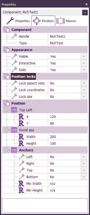
The Position tab contains the various position and scale properties for the selected panel component or object and used to specify to location and size of the component or object on the panel.
You can directly manipulate the component by using the Position section of the Properties Panel when the component is selected, here you can change the location of the component by altering the Coordinates. For components on the 3D System Panel you can also change the Scale of the component and even manipulate the component's Rotation on the panel, this can all be done relative to Local and World Space.
The Macros tab lists the macros that are available for that component. These can be dragged onto a user macro to call that macro when a program is executed. See Component Macro Icon Properties.
Properties and Categories
With the Panel root object selected you can add your own properties and categories to allow your program to easily customised to run in different types of ways. This then plugs into the component creation interface to allow your custom properties to appear when your exported component is selected.
Component Renaming
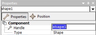
A component or object can be given a specific name by selecting the object on the panel and then editing the name in the Handle field of the properties window.
Advanced Features
Properties names and variables
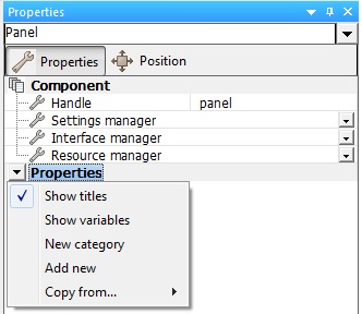
For the ability to display the property names as variables you can click on the properties heading to get a menu.
Visible, Interactive and Solid
There are a number of Flags available to determine how the component or object will react in the system.
Visible - Determines if the component or object can be seen.
Interactive - Determines if the component or object can be used to collect mouse events such as clicks or drags.
Solid - Determines if the component or object will work with the panel collision system.
Position Locks
There are an additional number of position lock Flags available to determine how the component or object will react in the system.
The Locks are only available when the Panel root object is selected allowing you to apply the rule to all the components and objects within your current project. If you then export the project as a component then the component will be initialised with the lock settings.
Aspect Ratio - Determines if the component or object can be none uniformly scaled.
Coordinates - Determines if the component or object can be moved around on the panel.
Size - Determines if the component or object can be scaled or re-sized.
Rotation - Determines if the component or object can be rotated on the panel.
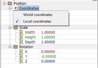
Coordinates world and local
For the ability to display the coordinate properties in respect to local space or world space you can click on the coordinates heading to get a menu.
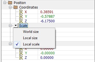
Scales world size, local size and local scale
For the ability to display the scale properties in respect to world size, local size or local scale you can click on the scale heading to get a menu.
Anchors
2D panel objects can be anchored to any edge of the panel, allowing objects to move when the panel is resized. Anchoring an object to opposite edges (e.g. both left and right) will cause the component to automatically resize when the panel is resized. The Min Width and Min Height properties prevent a resized component from becoming too small.
If a 2D panel contains a single component, that component can be made to fill the whole panel and resize appropriately. To do this, set Fit component to "Yes" in the properties of that 2D panel.
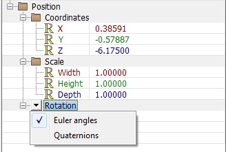
Rotations Euler angles and quaternions
For the ability to display the rotation properties in Euler angles or quaternions you can click on the rotation heading to get a menu.
Further information
For extra information on specific components see the Component Help Files on the wiki by searching the component name, the globally unique identifier (GUID) or by using the Components page to browse through and find components.
See the Component article for extra information on the role of components and how they are integrated into Flowcode, you can also look at other articles throughout the wiki to see various methods and techniques to use and create components.


